Correlation
[1]:
import pandas as pd
import matplotlib.pyplot as plt
import numpy as np
import math
import scipy.stats

food = pd.read_pickle("../data/processed/food")
With nominal variables we have seen that we can perform a chi–squared test of association to see if there is a relationship between the two variables. If we have two variables that are both at least ordinal we can use more powerful statistical techniques and test more purposeful hypotheses.
For example, with nominal data we can only test to see if there is an association. We cannot test the nature or size of this association (except with 2x2 contingency tables we can calculate odds ratios). With ordinal or scale data we can explore the strength of the association between them. One such technique is correlation.
Correlation is used to determine the strength of association between two variables, usually from one individual. For example we could calculate the correlation between the height and weight of each individual.
There are several correlation statistics we can compute, and these are dependent on the level of measurement of our data.
Pearson’s correlation coefficient, \(r\)
Pearson’s correlation coefficient, \(r\), is a measure of effect size (or correlation) between two numerical (interval or scale) variables. It works on the principle that as the difference from the mean for one variable increases we expect the difference from the mean for the related variable to increase (positive correlation) or decrease (negative correlation).
\(r\) is standardised, which is useful because:
- tests of all sorts of units can be compared which each other,
- the result is between -1 (perfect negative association), through 0 (no association), and 1 (perfect positive association)
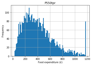
Let’s say we hypothesise that people with higher incomes spend more money on food (they have more money to shop at Waitrose). Expenditure on food is top–coded (see the histogram below) so for the purpose of this example let’s remove the top code:
[2]:
food.hist(column = "P550tpr", bins = 100)
plt.xlabel("Food expenditure (£)")
plt.ylabel("Frequency")
[2]:
Text(0, 0.5, 'Frequency')
[3]:
food = food[food.P550tpr < food.P550tpr.max()]
If we take an individual with a high income (their income deviates from the mean) we would expect their expenditure to also deviate from the expenditure mean. These deviations from the mean are their variances, so we are stating that we expect income and expenditure on food to covary. This principle is used to calculate the Pearson correlation coefficient (usually just called the correlation), which is a standardised measure of how much the two variables vary together.
[4]:
scipy.stats.pearsonr(
    food["P344pr"], food["P550tpr"]
)
[4]:
(0.6317428068963729, 0.0)
In this example the first number is the correlation coefficient and the second number is its associated \(p\) value.
The correlation is positive so as income goes up, expenditure on food goes up (if it were negative it would be a negative correlation, which would state that as income went up expenditure on food went down for some reason). The value of 0.63 suggests 63% (\(0.63 \times 100\)) of the variance in expenditure is accounted for by income (so the correlation is strong).
The \(p\) value is \(<< 0.01\) (\(<<\) means ‘much less than’) so it is highly improbable we would see a correlation this large by chance alone, so we have strong evidence to reject the null hypothesis and conclude that there is an association between income and expenditure on food.
Assumptions
Pearson’s correlation coefficient makes the following assumptions for the \(p\) value to be valid:
- both variables are numeric,
- both variables are normally distributed, and
- there shouldn’t be any outliers (defined as any values more than 3.29 standard deviations from the mean).
In this case our variables are numeric (income and expenditure) so this assumption is met.
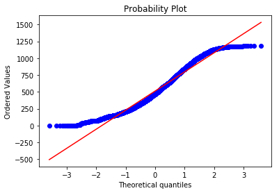
To test if the variables are normally distributed we can plot a QQ plot. If the variable plotted is normally distributed it should lie along the straight red line:
[5]:
# income
scipy.stats.probplot(food.P344pr, plot = plt)
[5]:
((array([-3.59517205, -3.35736793, -3.2261741 , ...,  3.2261741 ,
          3.35736793,  3.59517205]),
  array([   0.   ,    0.   ,    0.   , ..., 1178.775, 1180.175, 1181.54 ])),
 (283.2065477823062, 513.1222675247656, 0.9805846375524395))
[6]:
# Expenditure
scipy.stats.probplot(food.P550tpr, plot = plt)
[6]:
((array([-3.59517205, -3.35736793, -3.2261741 , ...,  3.2261741 ,
          3.35736793,  3.59517205]),
  array([  30.525     ,   31.95200058,   32.13598298, ..., 1149.0082924 ,
         1153.87332197, 1159.28534564])),
 (220.0619650033565, 400.6389031098243, 0.9746798740473717))
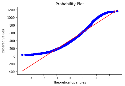
Clearly neither income nor expenditure are normally distributed, so this is a violation of the assumption and may be a problem. Let’s move on to outliers for now.
Neither variable should have any outliers (defined as any value more than 3.29 standard deviations from the mean). For income this is ok:
[7]:
len(
    food[food.P344pr >
        food.P344pr.mean() + (3.29 * food.P344pr.std())]
)
[7]:
0
But there are a few outliers for the expenditure variable:
[8]:
len(
    food[food.P550tpr >
        food.P550tpr.mean() + (3.29 * food.P550tpr.std())]
)
[8]:
4
To be safe, let’s remove these for our example, but you would want to understand these outliers a bit more in any real research (i.e. why are they outliers?):
[9]:
food = food[food.P550tpr < food.P550tpr.mean() + (3.29 * food.P550tpr.std())]
A scatterplot of these two variables:
[10]:
food.plot.scatter("P344pr", "P550tpr")
plt.xlabel("Income")
plt.ylabel("Expenditure")
[10]:
Text(0, 0.5, 'Expenditure')
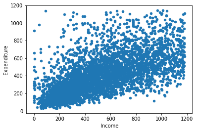
The points should be linear (i.e. a straight line) and roughly cylindrical to meet the assumptions. If it’s too conincal it means the deviances aren’t consistent (heteroskedasticity). If the assumptions of Pearson’s correlation coefficient are not met we can use a non–parametric correlation statistic, as we may need to do in the case of our example.
Spearman’s \(\rho\)
Spearman’s \(\rho\) (pronounced ‘row’) is a non–parametric correlation statistic that is very useful when we cannot use Pearson’s correlation coefficient, either because our data is ordinal but not numerical (interval or scale) or otherwise violates the assumptions of Pearson’s \(r\).
This is a non–parametric test. Non–parametric tests tend to be more robust (which is why we can use them when we violate some of the assumptions of the parametric equivalents, in this case Pearon’s \(r\)) but sometimes have lower statistical power. Therefore, try to use the parametric version by default and switch to the non–parametric version when necessary.
A Spearman correlation test of our variables (income and expenditure) is as follows:
[11]:
scipy.stats.spearmanr(
    food["P344pr"], food["P550tpr"]
)
[11]:
SpearmanrResult(correlation=0.6908560599405571, pvalue=0.0)
As you can see in this example the correlation statistic (denoted \(r_{s}\)) is very similar to the results of the Pearson’s \(r\) and the \(p\) value is still significant (\(<< 0.01\)).
Kendall’s \(\tau\)
Kendall’s \(\tau\) (pronounced to rhyme with ‘ow’, or more correctly as ‘taff’) is another non–parametric correlation statistic, similar to Spearman’s \(\rho\), but useful when we have lots of tied ranks.
Tied ranks means that the data share the same value. For example, if we have five possible responses (1–5) and 100 respondents in our sample we must have a lot of tied ranks (i.e. about 20 respondents tied for each level of response). This condition is quite common in the social sciences because we use Likert scales a lot (e.g. strongly agree, agree, neither agree nor disagree, disagree, strongly disagree).
This was not a problem for our example (income and food expenditure) because these responses were not tied. We can nevertheless still calculate Kendall’s \(\tau\) for these variables:
[12]:
scipy.stats.kendalltau(
    food["P344pr"], food["P550tpr"]
)
[12]:
KendalltauResult(correlation=0.5028338653574032, pvalue=0.0)
Notice that the \(p\) value is still significant (\(<< 0.01\)) but the estimate of the amount of correlation is lower.