Effect sizes
In [1]:
import pandas as pd
import matplotlib.pyplot as plt
import numpy as np
import math
import scipy.stats

food = pd.read_pickle("../data/processed/food")
Determining that there is an association is all very well and good, but it tells us nothing of what the size of the effect is. For example, our hypothesis test has determined it is probable that there is an association between the employment grade of the household reference person and tenure, but it does not tell us how much more likely they are to own their home.
The most common measures of effect size are:
- odds ratio
- Pearson’s correlation coefficient, \(r\)
There are others, for example Cohen’s \(d\) which is useful if the group sizes are very different, but these are the two most common in the social sciences.
Odds ratio
The odds ratio is a way of specifying the effect size for 2x2 contingency tables. For our example of employment grade and housing tenure we have more than a 2x2 table, but we can restate it so instead of just measuring an association between all employment grades and tenure types we can calculate the odds ratio of professional and managerial respondents owning their home and routine and manual respondents owning their home.
Here’s a reminder of the frequencies of all employment grades and tenure types:
In [2]:
pd.crosstab(index = food.A094r, columns = food.A121r, margins = True, margins_name = "Total")
Out[2]:
| A121r | 1 | 2 | 3 | Total |
|---|---|---|---|---|
| A094r | ||||
| 1 | 65 | 181 | 763 | 1009 |
| 2 | 81 | 129 | 404 | 614 |
| 3 | 282 | 222 | 476 | 980 |
| 4 | 75 | 82 | 34 | 191 |
| 5 | 361 | 101 | 1100 | 1562 |
| Total | 864 | 715 | 2777 | 4356 |
The odds ratio is the odds of one group for the event of interest divided by the odds of the other group for the event of interest. So we need two sets of odds.
First we specify the odds of the professional and managerial group owning their own home. This is the number of professional respondents who own their home (1282), divided by the number of professional respondents who do not own their home (70 + 237):
In [3]:
1282 / (70 + 237)
Out[3]:
4.175895765472313
This means that, roughly, for every professional and managerial respondent who does not own their home there are four who do.
Similarly the odds of a routine and manual respondent owning their home is the number of routine and manual respondents who own their home (523) divided by the number of routine and manual respondents who do not own their own home (289 + 233):
In [4]:
523 / (289 + 233)
Out[4]:
1.0019157088122606
This means that, roughly, for every routine and manual respondent who does not own their home there is one who does, so the odds are about equal or 1:1.
The odds ratio is simply one divided by the other:
In [5]:
(1282 / (70 + 237)) / (523 / (289 + 233))
Out[5]:
4.167911261140626
What this means is that professional and managerial respondents are 4.168 times more likely to own their home than routine and manual respondents.
Pearson’s correlation coefficient, \(r\)
\(r\) is standardised, which is useful because:
- tests of all sorts of units can be compared which each other,
- the result is between -1 (perfect negative association), through 0 (no association), and 1 (perfect positive association)
\(r\) is a measure of effect size (or correlation) between two numerical variables. It works on the principle that as the difference from the mean for one variable increases we expect the difference from the mean for the related variable to increase (positive correlation) or decrease (negative correlation).
For example the mean income is:
In [6]:
food.P344pr.mean()
Out[6]:
518.3056177244473
Let’s say we hypothesise that people with higher incomes spend more money on food (they have more money to shop at Waitrose). Expenditure is top–coded, so let’s trim the data like we did for income and take a look at the resulting distribution:
In [7]:
food = food[food.P550tpr < food.P550tpr.max()]
food.hist(column = "P550tpr", bins = 100)
plt.xlabel("Food expenditure (£)")
plt.ylabel("Frequency")
Out[7]:
Text(0, 0.5, 'Frequency')
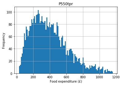
The mean expenditure is:
In [8]:
food.P550tpr.mean()
Out[8]:
400.63890310982424
If we take an individual with a high income (their income deviates from the mean) we would expect their expenditure to also deviate from the expenditure mean. These deviations from the mean are their variances, so we are stating that we expect income and expenditure on food to covary. This principle is used to calculate the Pearson correlation coefficient (usually just called the correlation), which is a standardised measure of how much the two variables vary together.
In [9]:
scipy.stats.pearsonr(
    food["P344pr"], food["P550tpr"]
)
Out[9]:
(0.6317428068963729, 0.0)
In this example the first number is the correlation coefficient and the second number is its associated \(p\) value.
The correlation is positive so as income goes up, expenditure on food goes up (if it were negative it would be a negative correlation, which would state that as income went up expenditure on food went down for some reason). The value of 0.63 suggests quite a lot of the variance in expenditure is accounted for by income (so the correlation is strong).
The \(p\) value is \(<< 0.01\) (\(<<\) means ‘much less than’) so it is highly improbable we would see a correlation this large by chance alone, so we have strong evidence to reject the null hypothesis and conclude that there is an association between income and expenditure on food.
Assumptions
Pearson’s correlation coefficient assumes that both variables are numeric and normally distributed for the \(p\) value to be accurate. In this case our variables are numeric (income and expenditure) so this assumption is met.
Neither variable should have any outliers (defined as any value greater than the mean + 3.29 standard deviations). For income this is ok:
In [10]:
len(
    food[food.P344pr >
                 food.P344pr.mean() + (3.29 * food.P344pr.std())]
)
Out[10]:
0
But there are a few outliers for the expenditure variable:
In [11]:
len(
    food[food.P550tpr >
                 food.P550tpr.mean() + (3.29 * food.P550tpr.std())]
)
Out[11]:
4
To be safe, let’s remove these:
In [12]:
food = food[food.P550tpr < food.P550tpr.mean() + (3.29 * food.P550tpr.std())]
A scatterplot of these two variables:
In [13]:
food.plot.scatter("P344pr", "P550tpr")
plt.xlabel("Income")
plt.ylabel("Expenditure")
Out[13]:
Text(0, 0.5, 'Expenditure')
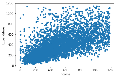
The points should be linear (i.e. a straight line) and roughly cylindrical to meet the assumptions. If it’s too conincal it means the deviances aren’t consistent (heteroskedasticity).
If these assumptions aren’t true of our data we can use Spearman’s :math:`rho` (pronounced ‘row’). Spearman’s \(\rho\) is also useful when we have a numeric variable and an ordinal variable (something we couldn’t test with Pearson’s \(r\)).
This is a non–parametric test. Non–parametric tests tend to be more robust (which is why we can use them when we violate some of the assumptions of the parametric equivalents, in this case Pearon’s \(r\)) but sometimes have lower statistical power. Therefore, try to use the parametric version by default and switch to the non–parametric version when necessary.
In [14]:
scipy.stats.spearmanr(
    food["P344pr"], food["P550tpr"]
)
Out[14]:
SpearmanrResult(correlation=0.6908560599405571, pvalue=0.0)
As you can see in this example the correlation statistic is very similar and the \(p\) value is still significant (\(<< 0.01\)).